For redesigning my companion app for tablet and a web version, it was a pretty simple process. I did start by searching for what the best ways to do this were, but I didn’t get far with that, so I decided I would resize everything. For the tablet, I used a resolution of 768 x 1024 pixels. I started by copying and pasting the mobile app into another page and started resizing everything until I came into a problem where it didn’t resize the text or certain images. So I did some research and I found out about the keybind ‘K’, where it resizes text and images without the need to change the font size. This was helpful because it made the process faster. I also changed the position of a few icons, like the hamburger menus.
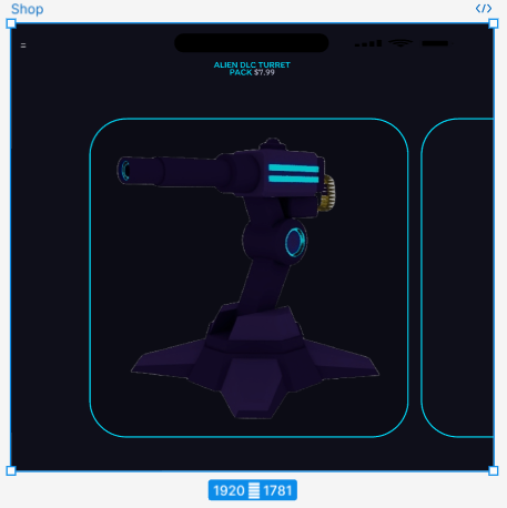
For the redesign of the mobile to web, this took much longer as I needed to scale everything up dramatically and also needed to rearrange everything so it looked natural and wasn’t messy. I started with copying and pasting again and used the ‘K’ keybind, but it never looked visually appealing. So I decided I would enlarge everything by either x1.5 or x1.2, and I found that was a good balance between it looking messy and realistic. I also had to rearrange a lot of things to make it fit the screen, and most of the time, the web never needed scroll bars, unlike the mobile design does. I also came into a problem with the carousels because of the resolution, the images would have had to be huge, and it didn’t look right. So I decided I would delete the smart animation for the carousels and just make it so it would be a simple ‘scroll with parent horizontally’, and I figured that would work perfectly fine.
This would have had to be the scale of the images for the smart carousel to work.