For my companion app for my 3D tower defence game, I decided to design it for a base game and 2 DLC’s instead of a game series. This was because I had an idea for this game for awhile and thought it would work better if I added DLC’s to it.
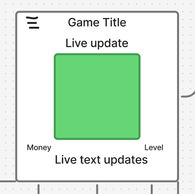
The central hub for my companion app will be the Home page, which will have the live view of your base and also a feed telling you any updates which have happened whilst the player has been away from their desk.
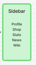
Navigation is handled through a hamburger menu in the top left corner, and this will open up a sidebar where there will be 5 different sections for the player to choose from. I want to make the navigation as accessible as possible so there’s no confusion for the player.
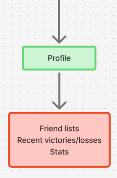
- Profile- Displays the player’s friendlist, recent wins/losses, win ratio and average match duration. This will help track the player’s multiplayer performances.
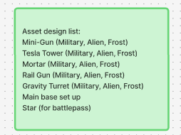
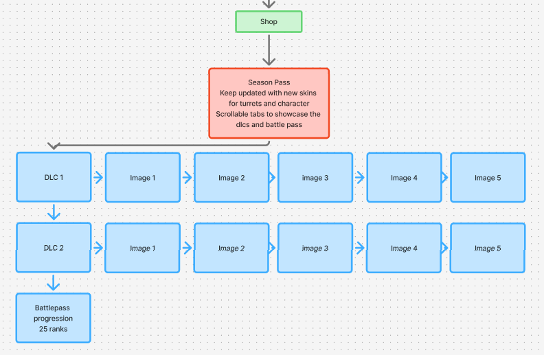
2. Shop- It will have a carousel view of dlc’s which have been released and battle pass progress. This will show that there’s extra content to see.
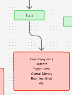
3. Stats- A breakdown of the player’s stats and this will show statistics of ingame completions, including how many wins, players’ levels/ranks, overall money obtained, enemies killed and will have a list of all achievements which have been unlocked.
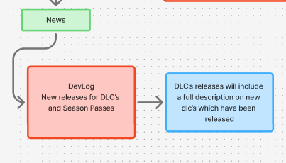
News- Features Newsletters from the developers, this will be useful for the player to keep up with updates, development logs and DLC releases for the game.
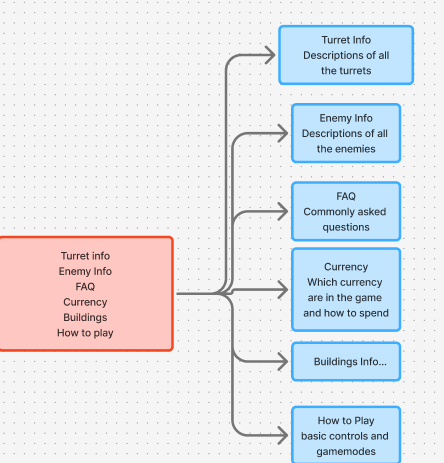
5. Wiki- A comprehensive in-app knowledge base for the player to use for tips, gameplay guides and breakdowns of features which are added. This will support the player whilst they play.
The wireframe for the UI layout and user flow were mapped out in figjam. Every screen was designed to make it so the essential information was accessible within just 1-2 taps. This minimises confusion for the player.